





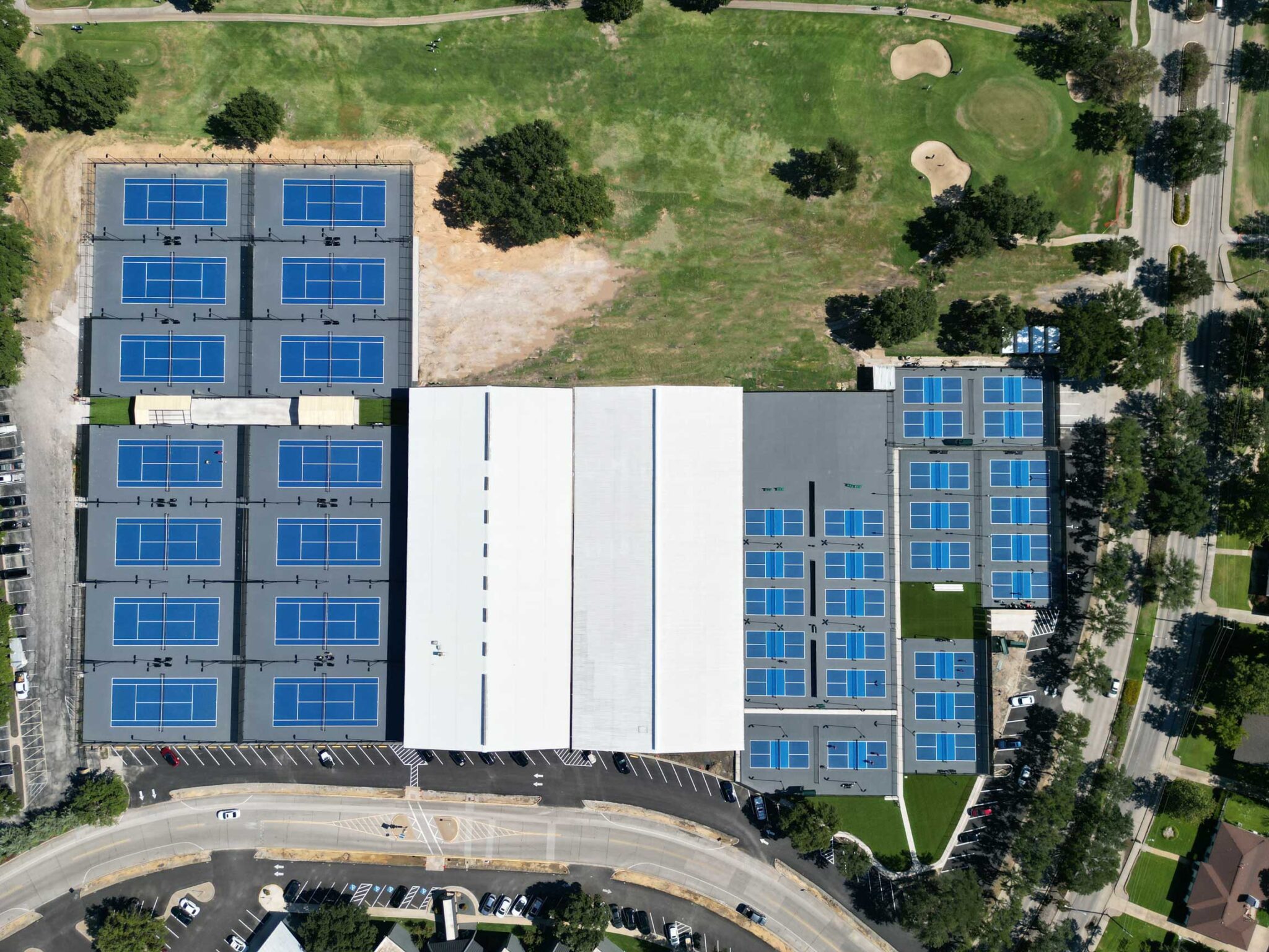
Court color is a performance decision wearing a style costume. The ball has to pop against the surface, the kitchen should read instantly, and the court can't turn into a skillet in July. Here's how the pros' courts get colored.
The three rules
- Ball contrast first. Pickleballs are yellow-green — blues and greens make them pop; avoid yellows and light greens.
- Two-tone the kitchen. A contrasting non-volley zone gives players and refs instant depth cues. It's the modern standard everywhere.
- Mind the heat. Dark colors run 20–30°F hotter in full sun. Sun-baked courts should lean mid-tone.
Combinations clubs keep choosing
- Blue court / green kitchen / green surround — the classic, maximum ball visibility.
- Green court / blue kitchen — the reverse, softer on big multi-court installs.
- Slate + brick — premium clubs wanting a signature look.
- Tournament looks — the PPA venues we surface run high-contrast combinations chosen for broadcast cameras. If it reads on TV, it reads from your porch.
See it before you commit
Every combination above is in the Court Designer — pick court, kitchen, and surround colors on a regulation layout and see it live. The full standard palette is on the color options page, and custom matching is available for schools and brands.
Paint is a system, not a color
Whatever palette you pick, it should go down as 100% acrylic color coats over proper resurfacer — the court paint guide covers the stack, and Acrytech ships every color at PPA texture spec.